Last week we looked at the ability of art to elicit emotions, so this week we will delve a little deeper into the role that colour plays in visual art and the power it has to make us feel a certain way.
Colour is key, whether you are selecting a new car, a fresh colour scheme for your home, or an item of clothing. It is something which we give great consideration to, and with good reason.
Russian painter and theorist Wassily Kandinksy is purported to have once said “colour is a power which directly influences the soul”, and therefore has the ability to influence our moods, emotions and even actions.
In terms of what we actually 'see', context effects the perception of a colour. Greek philosopher Aristotle is said to have declared “the appearance of colours is profoundly affected by their juxtaposition with one another”, meaning that a colour and its effect doesn't simply exist as an isolated entity, but also through
its proximity to and relationship with other colours.

Many of you may remember the great social media debate a number of years ago about the photograph of a dress. 70% of people pledged that they viewed the dress as “white and gold”, when the dress in reality was “blue and black”.
Context, lighting, and the dress' two colours juxtaposed played a part in the
viewer's perception of the colours, and when looking at just a small area of the dress without surrounding colours, it was clear to see that it was indeed blue.
This phenomenon, 'the deceptiveness of colour' (a facet of the broader theory of 'the interaction of colour’), has actually been studied in great depth for many years, and can be employed by visual artists in order to create interesting effects.
German born artist Josef Albers, who had solo shows at MoMa and the New York Metropolitan Museum of Art, is considered one of the most influential 20th century teachers of visual arts.
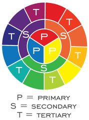
In 1963, he published his book Interaction of Colour, in which he featured what he coined as his 'colour systems', a range of associations which he attached to specific colours on his triangular colour model (see diagram, above) along with descriptions of primary, secondary and tertiary colour (see colour wheel diagram, left).
Albers also created a series of courses and exercises with which to observe and experiment with the placement and subsequent effects on the perception of colour.


One exercise involves selecting three colours (two background colours, and a third colour to be laid over each of the background colours). Curiously, the third colour appears lighter against one of the background colours, and darker against the other, even though it is precisely the same colour. It is the contiguity of the colours that causes this resultant effect (see diagram, right).
Another fascinating optical illusion, created in 1995 by Edward H Adelson, uses 3D elements and the juxtaposition of alternate colours to trick the eye into thinking that the squares marked A and B are different shades of grey, when they are actually exactly the same colour (see image, below).

(photo: Original by Edward H Adelson, vectorized by Pbroks13 [copyrighted free use], via https://commons.wikimedia.org/wiki/File:Checker_shadow_illusion.svg)
Even here at Collier & Dobson, the interaction of colour is utilised in the proofing process for producing our limited edition prints.
The process involves using our high-end flat bed scanner to capture an exceptionally high quality image of the original artwork, then professional creative software is used to digitally edit each of the colours, to resemble the colours of the original as closely as possible.
This is not as simple as making sure that each printed colour, in isolation, matches each colour in the original, however. The relationship between each of the printed colours must also be considered. So, part of the process of creating a print which appears to be the same colour as the original involves analysing and experimenting with the way in which each of the printed colours also appear against one another, also known as simultaneous contrast.

A reason for this is that the inks and media used to create prints are different from the ones used to create the original artwork, so light will be reflected from the surface differently and will, therefore, effect the appearance of the colours in a different way.
In a similar way to some of the optical illusions and experiments discussed in this article, if you isolate an individual colour in one of our prints, it may not look the same as that of the original, but when the printed image is viewed in full, it appears identical.
Along with Albers, the teachings (at the German art school Bauhaus) of the aforementioned Wassily Kandinsky, abstract artist Paul Klee, and Bauhaus Master Johannes Itten, are attributed with influencing the way in which we understand and communicate the profound psychological effect that colour has on us all to this very day.
The colour wheel, and its derivatives, that you will likely have encountered at some point in your life, originates with Johannes Itten's graphical scheme.

He was also a forerunner for formally designating the terms 'warm' and 'cool' to colour groups, and associating them with moods (a concept originally explored
by German poet Johan Wolfgang von Goethe, in his 1810 book Theory of Colours).
During his tenure, Itten taught that there were seven main types of contrast in colour work:
- Contrast between warm/cool colours- Contrast of extension (the contrast between two differently sized areas of colour)
- Contrast of hue (the degree to which colours can be distinguished from one another)
- Light/dark contrast
- Saturation contrast (the contrast between diluted colours and pure colours)
- Complementary contrast (colours which appear opposite each other on the colour wheel)
- Simultaneous contrast
A great example of the contrast of warm and cool colours can be seen in young contemporary artist Josie Appleby's limited edition print Yearlings, which makes use of a cool inky blue background, punctuated with warm red/brown swathes of paint which elegantly suggest the equine form of the artwork's subject.
Scottish artist Heather M Nisbet is skilled in the mastery of utilising colour in visual art, and her palette is influenced by her surroundings. Now living in rural Kirkcudbright, she has found herself using more cool blues and greens to depict “calm and serene views”, as can be seen in limited edition print View from the Isle.

Her other pieces Autumn in the Village and Patchwork Fields also remarkably demonstrate the use of complementary contrast, by her placement of areas of blue against orange, and red against green, whilst also balancing the contrasting areas of colour within the compositions, and thereby employing the contrast of extension colour discipline.
One of the joyful things about art is that you do not need to be learned in the theory of colour, nor a fine artist, nor scholar yourself in order to admire and experience the effects of colour. Whilst the theory is copious and definitely
intriguing, an understanding or knowledge of it is not necessary for an observer of art to feel the effects, because reactions to a particular colour or arrangement of colours is a basic natural response.
Why not head over to our online gallery and browse through our collections?
See if you can find some of your own favourite examples of contrasts in colour.