We spend a lot of time carefully perusing paint swatches and flicking through fabric samples to find the colours that are 'just right' for our homes, even finding ourselves revisiting them and redecorating only a few years later.
Not only do we make colour choices to reflect and help communicate the way in which we are currently feeling but we might also choose specific colours to influence how we aspire to feel.
Updating our surroundings can have a transformative effect on ourselves as well as our homes.
Have you ever noticed that some people wear a heavily black or grey themed wardrobe when they are feeling low? Their colour choice could be projecting their current mood. You may have even found yourself drawn to more sombre palettes yourself during such times.
We can, however, help counter melancholic moods and ignite feelings of optimism and peace within us by exposing ourselves to bright and cheery colours like warm yellows and oranges, or soft greens and pastel blues.

The selections we make to colour our homes can also be influenced by what is going on in the world around us, by our experiences, and our expectations. For example, during the pandemic many of us were confined to our homes and were denied exposure to the colours of nature and open green spaces.
According to the Creative Director of Dulux, this has led to a surge in demand
for green interior elements, from green velvet sofas to olive green walls, and jewel green glass accessories.
A whopping 80% increase in searches for green-themed rooms was even noted on Pinterest this year. This testifies to the power that colour has over our mood and the part it plays in fulfilling some basic psychological needs.

Now, almost two years into the global pandemic, many people may be finding themselves more accepting of the 'new normal', are perhaps buoyed by progress in medical interventions, comforted by the support of their communities, or just hopeful for brighter things to come.
Because of this mood shift, popular UK interiors publication House Beautiful posits that in 2022 our “choice of colour palette will become more confident as we experience new feelings of hope and positivity for the future”.
Demonstrably, the Pantone Color of the Year was recently announced as 'PANTONE 17-3938 Very Peri'. This soft lilac shade builds on a current trend for colours in the calming blue family, by combining it with red (associated with strength), to create a hue which inspires reflection, hope and creativity. This delicate shade is surprisingly versatile, having the ability to brighten a room when the sun is shining, but also create a calming atmosphere on days which are a little more overcast.

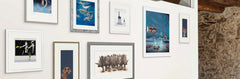
If a sense of comfort and calm tinged with hopefulness is something you think you could benefit from in your home, we have a range of wall art which would ideally suit this colour scheme, including new limited edition prints Decisions, Decisions by Dominique Salm, a striking depiction of a group of flamboyant flamingos; St Marks at Night by Alena Carvalho, a beautifully atmospheric
composition of a bustling Venetian square in a rich palette of magenta and mauve; and the simply serene lavender hued The Gulls by Chris Ross Williamson, a wonderfully narrative scene depicting a flock of birds following a solitary boat on the sea.
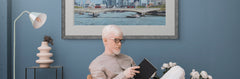
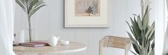
If you prefer a more nude palette 'greige' is set to take the top spot for the neutral-of-choice in 2022, combining the warmth of beige with the slick and contemporary look of grey. A neutral hue on walls allows you to inject bold splashes of colour in furniture, accessories and artwork, and the freedom to move them about, or swap colours in and out as-and-when it suits you.

Any colour you favour is likely to sit well with a nude backdrop, so pick a stunning piece of wall art from artists like Anthony Dobson, Dotty Earl, Bev Davies or Nicola Wakeling to reflect your current disposition, or to brighten your frame of mind.
Sorbet-stained interiors are also tipped to be a popular choice this year – think peppermint green, pastel peach, and an array of ice-cream colours to brighten your room, and your mood.

Head over to our interiors website to find furniture or home accessories like luminous lamps and cosy cushions, or browse the huge collection of wall art on our online gallery to find colourful artwork that suits your taste, mood, and aspirations.